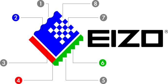
The EIZO Logo symbolizes our company’s brand identity, principles, and mission. It is the face of our business and an integral part of making our brand recognized and successful in every market.
All EIZO group companies, distributors, and partners must abide by these guidelines when representing EIZO and its products.
Always use the official logo data issued by EIZO Corporation.
EIZO Logo and guideline
EIZO Logo and guideline
The meaning of the EIZO logo
The colour of the EIZO logo used since 1996 represents RGB (Red, Green, Blue) constituting the three primary colours of light. In addition, various meanings and thoughts were included in the design.

- Analogue image (Sea of Japan)
- A sense of action and assertiveness in the corporate presence
- Interface image - Compatibility with the environment and the community
- Passion and a sense of mission as a corporate individual
- Digital symbol (The Hakusan mountain range)
- Consideration for and harmony with nature
- The checkered pattern historically symbolises controlled rationale and intellect
- Basic image pattern made up of pixels (snow)
