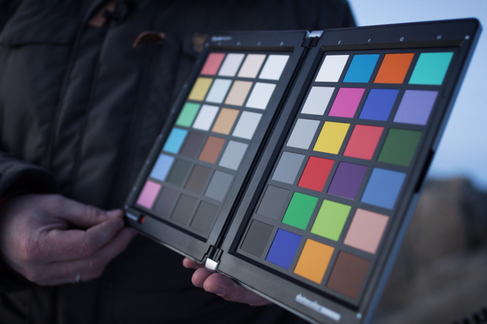
The file is always the central exchange medium in the colour-accurate workflow. Therefore it is vital that the retoucher always receives this file in a completely unadulterated format. Unfortunately, this is not the case for the vast majority of users. The required accuracy needs to first be achieved in a calibration process and maintained by regular recalibration.
Colour management
Monitor adjustment
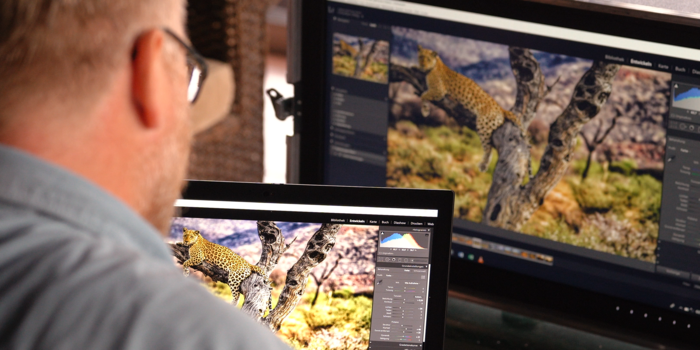
An accurate view of the image file using hardware calibration
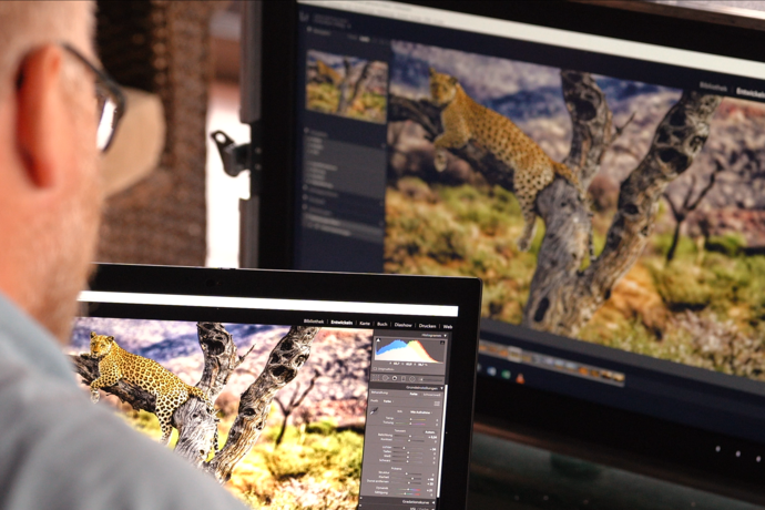
Many monitors are incorrectly configured, inaccurate, cannot even display the required colour gamut or add display errors to the image that are not even included in the file. Errors in the image display can usually be eliminated by calibration with subsequent adjustment. Calibration cannot ‘magically’ eliminate the shortcomings of the monitor such as a minimal colour gamut or inhomogeneities of the panel. Therefore it is extremely important to use a suitable monitor, typically referred to as a graphics monitor, that is to say, at EIZO a ColorEdge monitor. These devices have been specifically built to meet the needs of creative professionals.
Read more about hardware calibration here
Mythbuster: naturalness
At this point, it is time to dispel a widespread misconception: Reproducing colours on a monitor that are as natural as possible is not the goal of monitor adjustment. The goal is to display the image file for the retoucher as precisely as possible. If the image file is natural, the monitor display should also be as natural as possible. If the image file contains extremely vivid colours and rich in contrast, the monitor display should also reproduce vivid colours and rich in contrast. If a black-and-white image is being processed, the image display should only contain greyscale and no unnecessary colour. This is not so easy, considering that greyscale needs to also be mixed together by the monitor using the primary colours red, green and blue (RGB).
The correct adjustment target
You might now think that calibration is a binary process: calibrated and uncalibrated. If you want to calibrate for the first time, you will realise that you always have to calibrate your monitor to specific values, referred to as adjustment targets. This is necessary because we do not measure images in image processing with a measurement sensor. Instead, the viewer’s visual impression is the reference in image processing.
For this reason, we need to make sure during calibration that the viewer can view the image file, which the monitor reproduces with absolute accuracy, without any adulterations.
You can see how this is done in the sidebar video.
The adjustment target is determined by the lighting conditions at the image editing workstation
White balance
A light temperature of D50 = 5000 Kelvin has become the de facto standard in the printing context. At that illuminance, people can work with a standard under very controlled conditions and they can use illumination with a white balance of 5000 Kelvin as they traditionally would. Which is why you always hear that you need to use a white balance of 5000 Kelvin in printing. But it does not help the typical photographer at a standard image editing workstation, even if it is right in printing companies with their constant, standardised conditions. At a workstation with natural lighting, the ambient light is normally not 5000 Kelvin, but rather 6000 or 6500 Kelvin. This often changes during the course of the day depending on the weather or the specific lights in use. Experience shows that most users find images with a white balance of 5000 Kelvin too yellowish. As a consequence the processed image might appear too cold (too bluish). We recommend using 6000 Kelvin for the white balance as a starting value for calibration for this reason.
Brightness
Brightness is the next variable. The monitor should have the same brightness as the environment since the monitor’s reference is typically a printout held next to it. If the setting for the monitor is too bright, the tendency is to make the image too dark. If it is too dark, there is a danger that the image will turn out to be too bright. Therefore our recommendation for an average daylight workstation is to use a brightness of 120–140 cd/m2.
Additional settings
We recommend using the following variables for the adjustment target: gamma: 2.2, colour gamut: native, black level: minimal.
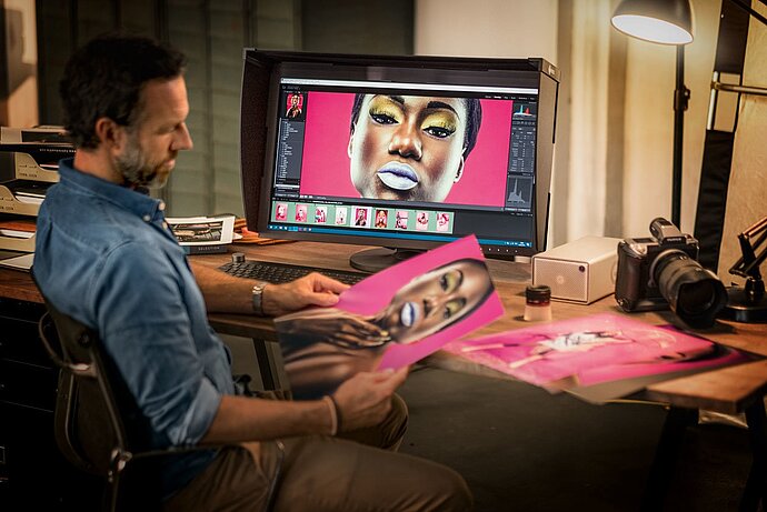
Summary: recommended basic settings
- Brightness: 120–140 cd/m²
- White balance: 6000 K
- Gamma: 2.2
- Colour gamut: native
You may need to create different adjustment targets for different lighting situations and activate them as needed if the lighting situations at your imaging editing workstation change. Typical targets are:
Sunny day:
- 140 cd/m²
- 6000 K
- Gamma: 2.2
- Colour gamut: native
Cloudy sky:
- 120 cd/m²
- 6500 K
- Gamma: 2.2
- Colour gamut: native
Artificial lighting:
- 90 cd/m²
- 5000 K
- Gamma: 2.2
- Colour gamut: native
These settings are only intended to be rough reference values, since we do not know the conditions prevalent at your workplace. But there is another, very decisive factor: the human factor – you. Every person perceives images/colours slightly different. Therefore, standardised adjustment targets only help to a limited extent. You have nothing to gain from a standardised adjustment target if the monitor display does not correspond to the image file under the given ambient conditions for your visual perception.
An image that looks completely neutral to you may appear colourful, too light or too dark to someone else. However, you are the person editing your images to your preferences, so the monitor display needs to match the image file to your visual perception. Therefore we recommend adjusting your monitor profile.
Our recommendation: Adjust your adjustment target
You should still adjust your original adjustment target if you want to create a perfect adjustment target that is ideal for your visual perception. We’ll show you how:
- Open your image in your image editing software (recommended: Adobe Photoshop or Lightroom).
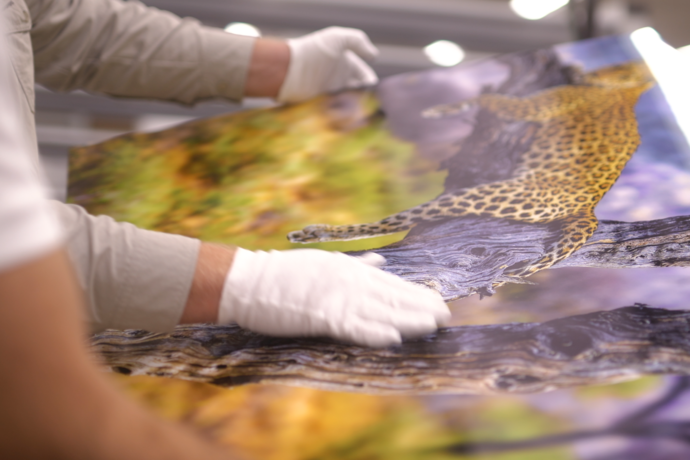
- Print out your image or order a printout from a service provider that provides its customers with ICC profiles for softproofing (recommendation: WhiteWall).
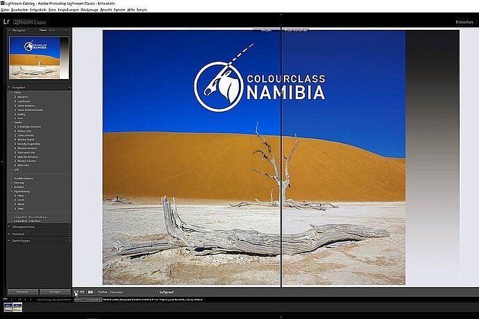
- Activate the softproofing view for your printout.
- Open ColorNavigator, select the Manual adjustment menu item. Move the programme window to one side enabling you to see as much of the image as possible.
- Hold your printout next to the monitor. It is important that the lighting is neutral and the CR index (wide visible spectrum) is as high as possible.
- Adjust your adjustment target until you have matched the monitor display with the printout as best as possible. Normally it is enough if you adjust the brightness and white balance. ColorNavigator will then create a new adjustment target. You can now recalibrate in the Advanced mode, if you want, to discover which white balance and brightness was used for adjusting the monitor. This provides you with information on your specific adjustment target, which is ideal for your visual perception under these lighting conditions. Of course, remember that this adjustment target is only ideal under these lighting conditions. If they change, you should create a separate adjustment target for each situation. If the monitor is used by different people, we recommend having each user create their own targets.


